22 Sep, 2026
What is a No-Code Platform & Build Apps Without Coding?
If you are looking to launch your software product quickly in the market, you might be asking: what is a no-code platform?…



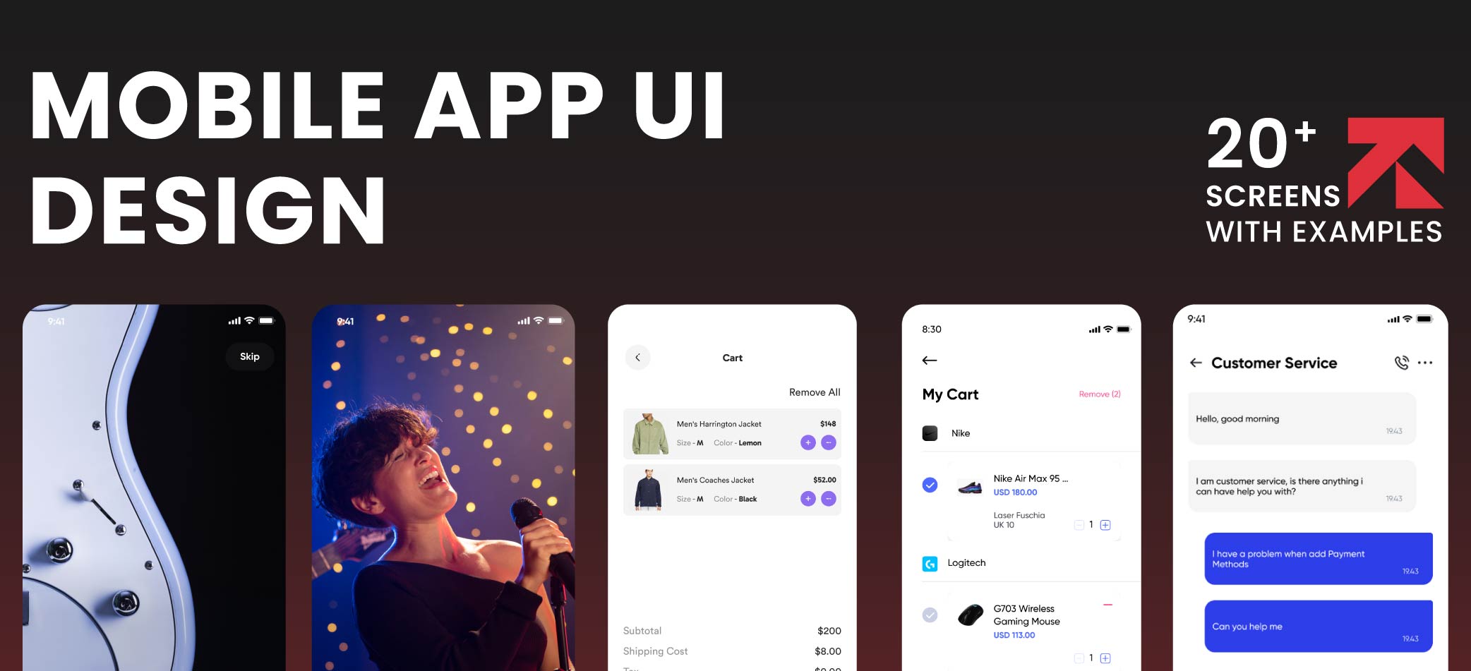
Did you know that more than 90% of people globally spend their time using mobile apps? In the USA, about 283 million people use mobile phones on a daily basis, spending time on 10 to 12 apps regularly. Primarily led by Apple, Samsung, Google, Meta, ByteDance and other iOS devices, the mobile application market is projected to reach USD 391.30 billion in 2026 and is expected to reach USD 864.5 billion by 2031, with a CAGR of 17.18%. Here comes the main hero: “mobile app UI design.” The user interface design decides how often users are likely to visit your app and use it frequently. Basically, mobile UI design in applications is the process of building interactive elements, such as screens, buttons, icons, colors, typography, images or sliders. These visuals are what users see when they use your app on iPhones or Android, guiding them to make important decisions related to account creation, product browsing, transactions, permissions and other engaging features. A good display is more than just design; the UI can increase the conversion rate up to 200% with an improved UX rate up to 400%. This blog revolves around design screens; I’ll discuss the 20 essential UI screens from splash to notification screen and how they affect your overall app experience.
The mobile app UI UX has a great impact on your brand success, as it makes your brand trustworthy, enjoyable and easy to use. Whether you’re developing a mobile app for fintech, healthcare, eCommerce or taxi, your app should be easy for your users to navigate.
Let’s understand the difference between UI and UX. UI (User Interface) focuses on how your app looks, like buttons or layouts. Whereas UX (User Experience) is how users feel while using those elements and how easily they interact with your product.
The UI and UX designers work closely for mobile app development. For example, if it’s a taxi app development, then the UX designer looks after the app structure, adds GPS locators in the system, logical workflows, and simple-to-follow tasks so that the driver can focus on the main actions per screen. For this, they plan the user journey from start to finish, including research, wireframes and address points that will solve the user’s actual problems.
In contrast, the UI designer will bring the UX designer’s idea to life. They add colors, fonts, buttons, spacing and icons that make the app easy to understand and use and increase readability while meeting the brand guidelines and design briefs. They will minimize clutter, maintain white space, and use user-friendly taxi booking buttons.
Together, they create a ride experience that leaves a lasting impression on both drivers and passengers.
Note that an aesthetically appealing screen doesn’t guarantee app functionality and customer satisfaction. You need to implement UX strategies; a 2 to 5 seconds load time is what retains your customers. That’s why attractive screens alone don’t create a good user experience.
Quick Answer
The 20 essential app UI design screens include splash, onboarding, welcome, sign-up, login, home, navigation, dashboard, search, listing, product detail, profile, settings, calendar, social, chat, cart, checkout, notifications, and empty, loading and error states.
User interface screens play an important role, starting from installing your app to daily use and leading to boosted growth of your brand with higher engagement. Explore the 20 essential UI screens for mobile apps that build the core architecture of your app, such as home screen, login, product details, checkout and empty states.
Splash Screen is the introductory display that appears on your app’s OS screen at the start. Consider it a welcome that marks a profound impact on your user’s mind about your app’s overall experience.
This app startup time lasts for 1 to 3 seconds and disappears as soon as the app loading is done. This provides a wider opportunity for you to emotionally connect users with your app and promote your brand via logos, a strict brand voice, a loading-state message with an icon and to avoid any delays.
To promote your brand, set your business logo at the top. Make sure the app loading symbol is simple, or use commonly used indicators, either spinner or skeleton loading icons.
Meanwhile, your app should complete the necessary steps to finalize app usage and purposes, such as data acquisition, session verification and API connection establishment behind the interface.
Also, avoid unnecessary delays in app loading. Keep it under 3 seconds. In short, do not make your user wait long at the entrance. The smoother they enter, the more likely they are to convert.

The onboarding screens are the welcoming screens consisting of 4 to 5 carousel images that tell first-time connecting users how to use the app, introduce features, and communicate your business core values.
Most people skip this screen due to a cluttered display, lots of features and other options. Keep it minimal and focus on beneficial features instead of listing all general features and end up losing your customer.
You can also introduce a preference selector, like topics they are interested in, goals and other tags to empower personalization over recommendation engines. This is how you can offer a custom experience right at the entrance of your app and make them feel more valued.
Always mention the Skip option along with Continue or Get Started to block user friction; it’s better to have an active customer than not even having one.

There is a difference between onboarding and the exact welcome screen. While the onboarding screen is for all users opening the app for the first time, the welcome screen is for users who have already used the app before or signed out and are restarting the app.
The onboarding explains how to use the application over multiple screens; the welcome screen is a single connection point where it greets the user when they start the app.
Mobile app screen design of the Welcome display is useful as it directly deploys the user for actual app usage after completion of the onboarding process.

A sign-up screen is more than just 2 fields filling the screen; it is the user interface that actually converts your user into a loyal customer. It consists of a header, input fields and a CTA. Users can insert their email address, password or personal details to either sign up or log in on the sign-up screen.
The required fields of the registration usually ask for name, email and password. For other crucial details, add a later input option to lessen the friction.
For security purposes, add an account verification process just before the Submit option; otherwise, it may irritate users. This validation step maintains platform integrity.
Make sure to display social authentication with high visibility of Open Authorization (OAuth) for dominant providers, such as Apple, Google or Facebook. The instant clickable options for registration offer effortless onboarding.

The login screen is the page of an app or website that contains options related to email address, username, password, help links and other authentication options.
Feature minimalist options on the login screen. The email address and username fields should have autofill layouts to speed up data entry.
Below that, add a hide/show password option represented with an interactive eye icon. It helps users in both cases, either to see or keep the password private while entering; users can also toggle the option for correct password entry.
Right under the password field, write an internal link about forgotten passwords. This helps users get redirected to the ID verification page and regain access to their account.
Furthermore, you can also add advanced security and authentication options. Biometric recognition, like Face ID or biometric authentication, helps maintain advanced security options. Such additional credential options enhance customers’ trust and loyalty.

The mobile home screen is the place that users visit the most; no matter which section or service they wanna head towards, they have to pass through the home screen.
The main navigation plays an important role and acts like a connecting bridge on the mobile app screen. It works like a map that connects all the major parts of the app together on the main screen.
Add primary content: your main service and offers that are beneficial for users. People are more attracted to outcomes instead of the processes or strategies behind them.
Ensure the placement of search and notifications at the top; search is usually located in the top middle, and notifications are either in the top right or top left corner.
Next comes the CTA button. The CTA button should be appealing while easily accessible. This is the point when your user converts into a customer, when they purchase an item, book an appointment or download something.
For example, the home screen UI of a healthcare app should contain uncluttered options like user profile, appointment booking or upcoming reservations, emergency consultations, SOS button, prescription or lab test results.
Bonus Tip:
Maintain the visual hierarchy by emphasizing the need for whitespace between the text, buttons or icons. As per ResearchGate, visual communication also helps older adults to easily use applications and reduce cognitive load.

This is the app’s main control section, menu and navigation screen; it covers the features, services, benefits and account.
Keep the bottom navigation bar fixed in position and limited to five taps. By prioritizing 3 to 5 bottom menu tabs that are crucial for your app, users are most likely to interact with just the movement of their thumb.
Another important feature is the three-lined hamburger menu on the top right or left. This menu typically contains account settings, secondary navigation, support, app preferences, history and other complementary tools. It also offers free screen space with its drawer style for interactive sessions.
Add a horizontal tab bar with core services. For example, for an entertainment app, top tabs should contain categories, library, popular streaming, and a specialized For You section for personalized results, considering the past search history.
Use the standard navigation hierarchy and a flat structure. Make sure your users don’t have to jump to more than three screens to reach the desired service.

The dashboard screen provides detailed information, analytics and performance metrics. It typically contains a profile, summary cards, quick action buttons, visuals, recent activity and a bottom navigation bar.
The metrics dashboard shows results in quantifiable cards; it provides users with easy-to-understand and easy-to-read information.
Next come quick action buttons. They guide the user to instantly process activities. For example, the Fintech app should contain actions like send, transfer, request, receive, pay bills, card control and other top-ups.
To build personal connections, welcome users with their personalized information. For example, welcome them by their name, show up-to-date results, live account status and user activity.

The mobile app search screen should have a search icon (most likely a magnifying glass) and a neat search box with clear placeholder text “Search here”. The word ‘here’ may differ depending on the app niche.
Typically, these options appear after cursor insertion in the search bar: suggestions, filters, sorting, recent searches and empty results.
Users can directly search the respective service in the search bar. It also sometimes has a clear X sign at the end to completely remove the entire text.
The suggestions make it easy to find popular or in-demand products. The matching queries automatically appear when the user enters a relevant search.
The flyout menu for filters and sorting enables easy access to finding the desired product. For example, in shopping apps, filter options like ready-made, unstitched clothes, co-ord sets or jumpsuits, sort items and refine results as per user needs.
Display recent searches to facilitate the user experience as per their past preferences.
In case of empty results, after the No relevant items tagline, add trending or most liked items at the bottom.

The mobile app design UI for the listing or catalog screen features all products in one place as per the user-selected filter. For example, eCommerce apps feature visual categories for best-selling articles, nearby restaurants in food apps, properties as per required location or budget in real estate apps, and services in marketplace apps.
Add infinite scroll or load more options as per goal and app type. Use infinite scroll for social media apps or eCommerce platforms; use Pagination for enterprise or business apps to give users more control.

It is the main screen that people interact with, where you are actually selling your services or products. This section provides comprehensive information about the page and makes conversion happen.
Usually contains images or videos, supporting two-finger zoom-in options for better product judgment for users.
Each item has its own product description and specs. Ensure clean and easy-to-find key details on service detail screens, such as sizing charts, guides, and other care instructions.
Buyers won’t spend a single penny if your product screen or brand doesn’t seem reliable. So, for audience trust, feature live customer views, the product count, product reviews, and ratings on the same page.
Always mention clear pricing, either before or after the discount or some special offer, and a primary transactional CTA button. For example, Add to Cart or Book Now.

The profile screen is important, no matter if it belongs to social media apps, eCommerce, SaaS or mobile games. This screen acts like a central hub to control personalization and manage preferences.
The main part of this screen is user information. It displays the day you joined the app, your email address, username, password, and profile picture.
Next comes account activity. It provides necessary information about past activities, likes, app activity time, saved items or favorites.
Options like preferences and profile editing allow uploading a new profile image, personal details and account settings. The complexity and details vary with different platform requirements.

The settings screen holds crucial importance in UI mobile design. It allows users to control app notifications, update passwords, two-factor authentication, manage subscription levels, change app preferences, and edit account details.
Options related to notifications lets you control preferences with toggle on and off options. There are primarily three options: receive notifications in the app, via email, or push notifications.
Privacy and security options must adhere to US compliance, such as the Federal Trade Commission (FTC), CCPA, HIPAA or COPPA. App developers are not allowed to collect users’ private information without the customer’s consent.
For global coverage, giving access to multiple languages and selections like Light or Dark themes in appearance enhances the overall app experience.

The calendar screen is important and should follow live synchronization, no matter if the app is restaurant booking, fitness tracking, transportation dispatching, ticket or event management.
A smooth experience comes over the top, regardless of the app niche. These utility screens handle time, date and availability of respective resources or services. Introduce interactive date pickers in calendars that clearly state available and booked slots.
Use Cases:
After completion of the booking process, the scheduling info displays summarize your reservation details, such as name, location, time, consultant and other details.

The timeline or social screens serve as the core engagement center for users. As per recent research, about 5.66 billion people scroll social media globally on a daily basis, which rounds up to about 69.7% of the total population.
These feed screens are designed to meet high-engagement content and engineered around behavioral psychology principles that trigger human impulses, such as stimulating content, peer achievements and other engagement-driven systems.
Prime features involved in social media platforms are posts, stories, comments, likes, sharing and infinite scrolling. According to recent studies, about 85.1% use WhatsApp regularly, 2.11 billion people use Facebook daily, and Instagram has a total of 3 billion users with monthly activity.

The chatting screens show genuine care when the connection is between the support team and the customer and are a mandatory communication tool for app design UI.
To support the conversation flow, you can offer a personalized chat background and message bubbles to let the user read the message without leaving the app.
Attachment options make the user journey more enchanting with options like files, images, voice notes, photo attachments or an emoji board.
Typing awareness indicators inform the user that the other party is writing something, with a cue: typing…
Read status informs that the message is delivered with an eye icon; send status with a single tick tells the message is sent, and a double tick shows that the message has been received.

Baymard research concludes that about 70.22% of people abandon carts due to bad checkout designs, window shopping and other reasons. Note that it is an important bridge between product discovery and transaction.
Establish a clear indication of selected items via an itemized list and price per item and add quantity selectors with easy-to-understand + or – signs.
Options like remove or edit order before finalizing make it easy to adjust the items instantly and prevent incorrect shipment.
The order summary breakdown clearly explicates the items customers are likely to purchase, including product cost, taxes, shipping fees, delivery address and payment details.

A most important and double-check point screen for users: the checkout screen. It is the last screen of your app design that the user will interact with.
The mobile app interface design should clearly mention the customer address, payment method, order summary and confirmation. People cross-check the entire shopping list at this stage to avoid any mistakes in the order.
Integrate mobile-friendly payment gateways, like Apple Pay, Google Pay, Stripe or PayPal.
Introduce applicable vouchers for loyal customers and discounts where relevant, before the Place Order button to reduce cart abandonment and improve customer satisfaction.

The mobile app notification center is a dedicated place that helps you track notification history. It also informs users about transactions and sends alerts about product deliveries.
The read and unread states are distinguished by a lightly tinted color for messages that need to be read and a plain or white background for the already read messages.
The notification categories segregate different types of notifications; users find it easier to filter notifications via the Updates, Primary, and Promotions tabs.
Quick actions allow users to directly delete, archive or mark as read notifications without opening them.

An underestimated screen, but it holds utmost importance when things don’t go as planned and helps users make it through the critical paths. For example:
The empty state reflects whether the cart is not filled or the folder has no files in it. It is also a conversion point; you can add CTAs like “Your cart is empty” or ” Explore best-selling ” to continue browsing.
For loading states, use a placeholder or skeleton screen instead of loaders. It is an app design UI that reflects the actual loading screen structure.
When encountering unsuccessful attempts, error states or failure modes, display helpful messages and retry actions like Retry or Refresh Page to guide users and not leave them all alone.

An academic study in HCI found that users initially evaluate apps based on visuals, which heavily relies on app UX to retain users. Note: the following mobile app user interface example screen needs a respective industry or market.
| Bonus Read: What is a no-code platform and how to build apps without coding

The key mobile UI design principles demand simplicity over clutter, easy navigation and focus on app usability. Explore below the fundamental rules of mobile app design.
Keep the navigation process simple with easy-to-locate top or bottom bars. This is a familiar practice that users find easy to use.
A mobile app interface calls for clear visual structures. Display what’s important upfront and either neglect or hide what is less important between steps.
Maintain the app user interface design so the user feels connected through the app experience, via similar buttons, icons and menus.
As per standard practice, use 44×44 pixels for touch so customers can easily touch without making mistakes.
The main converter or primary action buttons should be simple, easy to find and reach. Works better if it targets the exact thumb zone.
Mobile app interface design should have readable fonts and clear boundaries with specified spacing between the text and lines.
Use suitable contrast. Keep the text dark or bright enough against the background to ensure optimal readability.
Feature a visual sign to give instant feedback to users. For example, the CTA button changes once the order is completed.
Design the mobile application UI considering the standard WCAG guidelines for older adults and disabled individuals, like large fonts or color blind display.
The app design should support the display sizes of iPhones, Android, tablets, desktops and other devices for maximum reach.

UI design for mobile apps requires a clean display while meeting the strict technical requirements. Unlike websites, mobile app interfaces should not be limited to content viewing but to interactive engagement.
Let’s take a quick look at how to design mobile app UI step-by-step.
First, run user research and analyze at least 3 of your competitors’ apps. Notice the friction points and build your audience around those perspectives. Introduce your app’s unique selling points, and choose the platform you wanna build your app for, either iOS or Android.
Next, design the user goals and establish the crucial hierarchy of needs. The mobile UI should meet the market standards and customers’ expectations. For example, food apps should be more focused on orders, food delivery tracking and checkout. Keep the design clutter-free to reduce cognitive load.
Define the user flow with definite planning and clarify critical pathways. For example, in an eCommerce app, search for a product, add the item to the cart, and provide smooth checkout options. Also, establish unpredictable circumstances like poor internet connectivity, errors, cart abandonment, etc.
Now, create the wireframes of the app to see how things will work in real life. Create a low-fidelity design as an early-stage design, check features working, locate CTA as per thumb zone, identify gaps, test the app and fix the errors identified upon interaction.
Now design the UI by using standard design platforms such as Figma, Sketch or Adobe XD. Make sure to meet the UI design requirements with respect to platform requirements, such as Apple’s Human Interface Guidelines and Google’s Material Design for Android.
Next, build interactive prototypes to test the real user flow and early app usability, saving cost and time. This step validates the idea of product development and helps with intelligent developer handoff.
Ensure quality by testing the app from various perspectives. For example, you can use a platform like UserTesting for live app interaction, identify the gaps, and finally fix errors before the app is used by real users.
Finalize the setup and clean up your workstation, delete all unnecessary elements, fix gaps, conduct final refinement sessions, and then go through revisions for a smoother handoff to the development team.
An effective mobile user interface focuses on content clarity. Below, I have discussed some mobile UI design examples.
Take the app home screen examples of a popular platform, Spotify. The purpose of Spotify’s home screen is to resume the recent music the user was listening to; for visual hierarchy, the daily shortcuts and welcome sit at the top. It offers smooth navigation for home, search and library. It clearly displays the play CTA button. The content is organized vertically, like other market platforms. This design works for music apps with minimal yet important functions.
There comes a long list of mobile UI examples. Another popular app is Uber, a ride-booking app. The purpose of its home screen is to meet user needs; it displays the user’s location and the drop-off location options with a clear ride request CTA. Other than that, the visual hierarchy shows a map on the screen, with minimal menus like profile or safety. This design works because the content is well organized as per market demands and user needs.
Below, I’ve highlighted the most common mistakes the builders make while developing UI mobile apps.
Never fill the screen with irrelevant features. Just like I’ve discussed above, the design content needs to be relevant to ride-booking or music apps.
Nothing is better than keeping things simple. Never complicate the app navigation, menu and tabs. Keep mandatory app options on the homepage.
Keep the same interface throughout the screens of the app to maintain consistency. Also, it helps users identify the patterns, and they do not end up confused.
Use standard typography or as per user needs. For example, the base font size is 16 pixels for body copy in mobile applications.
Maintain the necessary touch space between all interactive elements, buttons or icons. Use 48×48 dp for Google apps and 44×44 pt for iOS apps.
Maintain the appearance of all visual elements of mobile apps with respect to size, color or weight.
Clearly announce error messages to reduce miscommitment issues and gain the user’s trust.
Never underestimate the empty or loading states; use interactive skeleton screens for loading pages of apps.
Make your app multi-device friendly; while meeting the new operating system models, do not forget to optimize for older versions as well.
Never ignore accessibility parameters. It is mandatory to meet accessibility rules as per USA laws and regulations.
Before finalizing the mobile app design, thoroughly go through this checklist to deliver a high-quality app.
In short, each mobile app UI design screen has a different purpose that changes with app type and domain needs. A good mobile user interface should address logical user flows and be easy to use. The app design should prioritize usability over just beautiful designs. Must conduct app tests before launching it to the market. There is a long list of screens; the combination of screens varies with different industries and as per requirements.

If you are looking to launch your software product quickly in the market, you might be asking: what is a no-code platform?…

Legacy app modernization is simply a process of refactoring and updating the old software systems to use modern frameworks, architectures, and infrastructures.…
![How to Create a Restaurant App from Scratch? [2026 Guide]](https://application.trangotech.com/wp-content/uploads/2026/09/featrue-img-01-768x350.webp "How to Create a Restaurant App from Scratch? [2026 Guide] 55")
What if I say that nearly half of your restaurant orders are simply because the queue line is too long or they…
Fill out the form, and our app development team will reach out to you shortly.
Let’s turn your idea into an app that drives engagement, increases revenue, and sets you apart from the competition.
Driving Change
Through Technology